Bupa Arabia came to us because they needed a UI revamp for their mobile app targeting corporate client representatives. However, our research showed that we could take it so much further. So, we gave them a brand new, simplified user experience with stunning visuals that brought Bupa Arabia’s branding to life.
Re-Thinking the Experience
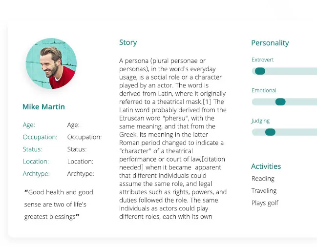
We re-designed the core user flow based on in-depth persona research. We identified what features really stood out and had to be highlighted.

An Optimized Search Experience
The app revolves around searching for information, so we knew we had to re-design the user’s journey to reflect this fact. With our revamp, detailed member information is always within reach.
Improved Document Management
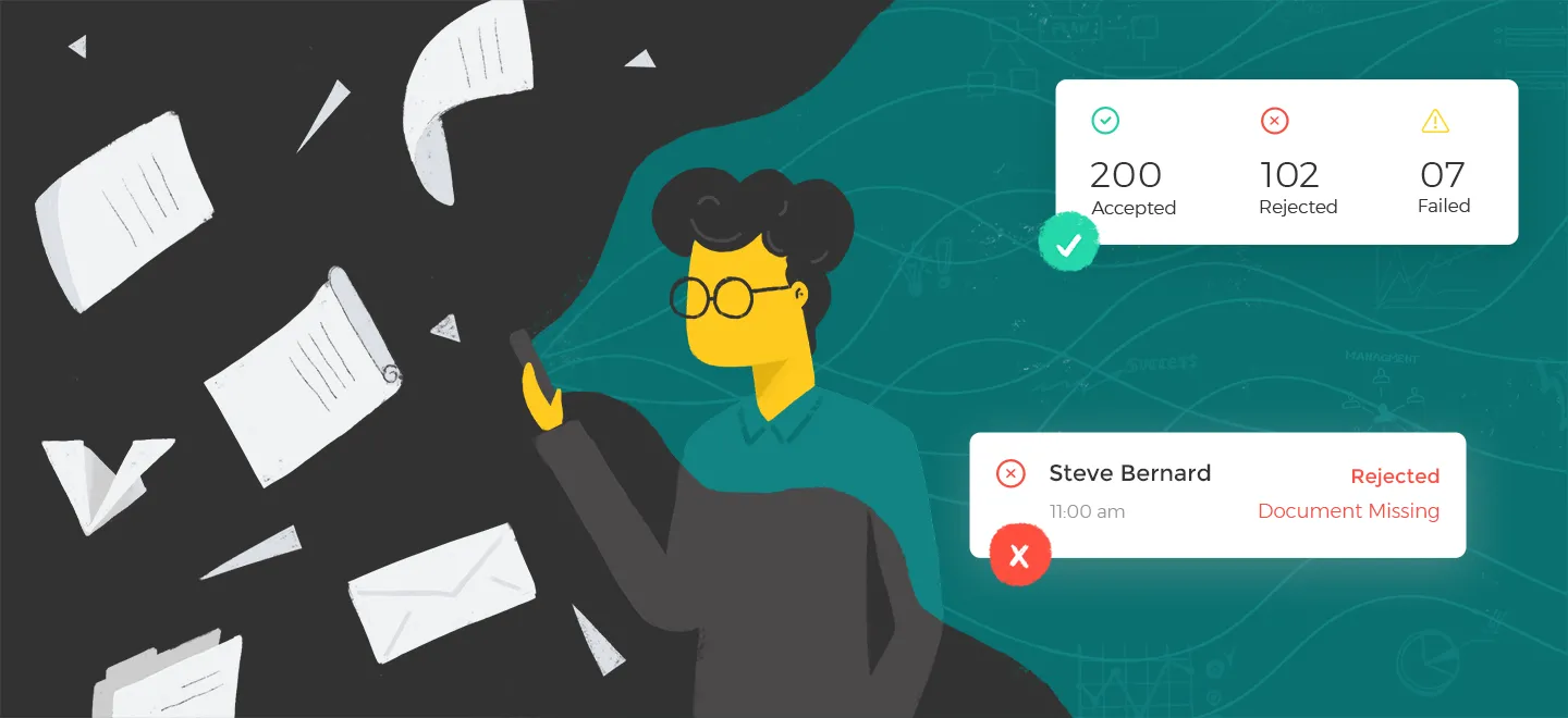
Who has the time to collect and deliver documents, then wait for approvals? With the document upload feature, all employee documents are uploaded and verified directly through the app, eliminating the hassle of a paper trail.
An Upgraded Communication Workflow
A comprehensive contact section that puts the user directly in touch with the right people at Bupa Arabia. The callback and complaint features make sure users always feel heard and supported.
- Call back the relationship manager
- Find all contacts in one place
- Decide when your complaint is closed
- Chat directly with Bupa


